More fun with maps
What might it look like if the size of nations were reflected by the number of people? Here's a novel idea from Reddit user JPalmz of switching around countries based on their populations:

A couple of TV based maps from Dan Meth:

Couldn't pass up his cool music chart on the 60's British invasion:
Not a bad ranking, though I'd say The Kinks should be the lone Colonel, The Animals a Major, The Dave Clark Five a Captain and all Captains and Lieutenants switch places. The pink is merely cannon fodder, though Manfred Mann and The Zombies may be considered for promotion.
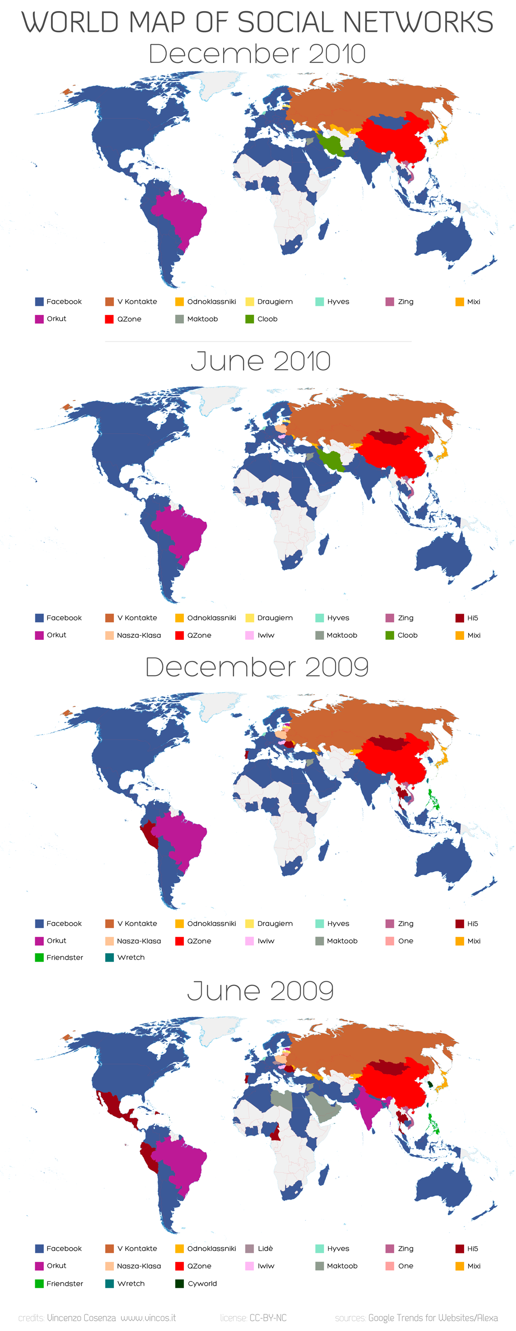
I didn't realize the world used so many different social networking sites - they won't be for long. Hard to tell which map is more daunting, the first one showing Facebook's assimilation progress, or the second one showing what friend networks look like on a world map.

Facebook - the new Borg.
The last map is an interactive map from the New York Times showing census information across the U.S. It doesn't sound too impressive, but it's easy to lose a couple of hours once you start playing with it.
posted by Scot at 5:46 PM
![]()

0 Comments:
Post a Comment
<< Home